Project overview
Discover Financial Services is a leading U.S.-based financial services company offering a comprehensive suite of products, including credit cards, personal loans, and banking services.
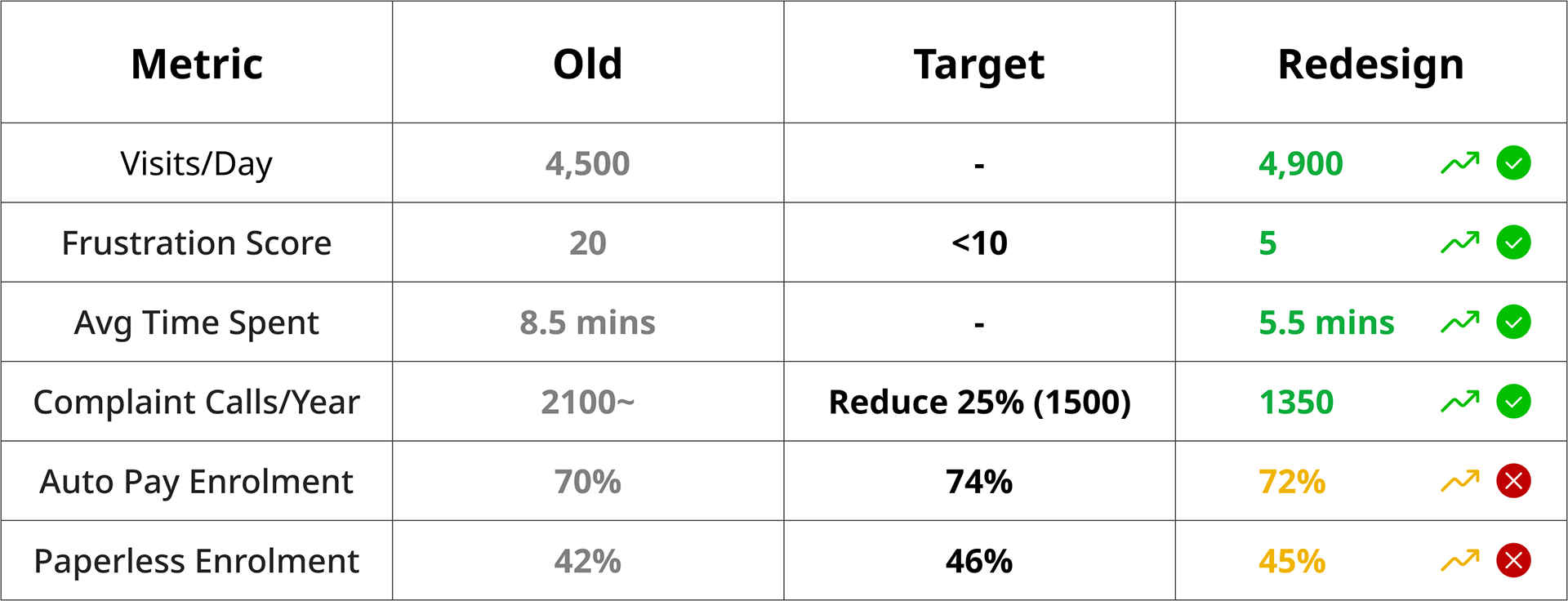
The Personal Loan Account Center is a key touchpoint for users managing their loans, but its previous design lacked clarity and responsiveness, causing confusion and friction. I led the redesign, focusing on improving usability, hierarchy, and responsiveness across devices. By using user research, behavioral analytics, and UX best practices, the redesign resulted in:
• Reduction in frustration: 20 🔴 → 5 🟢
• Fewer complaint calls: 175⚠️ → 115 ✅
• Improved session efficiency: 8.5 mins 🔴 → 5.5 mins 🟢
• Increased user engagement: 4,500 → 4,900 visits/day
This project showcases my ability to drive measurable impact through research-driven UX improvements.
Role:
Lead UX Designer
Lead UX Designer
Responsibilities:
• UX Strategy
• UX Strategy
• User Research
• User Behavior Monitoring & UX Performance Tracking
• Ideation Workshops & Design Ceremonies Facilitation
• Documentation & Design Specifications
• Development Collaboration & Support
• Accessibility Advocacy
• Agile Sprints & Cross-Functional Collaboration

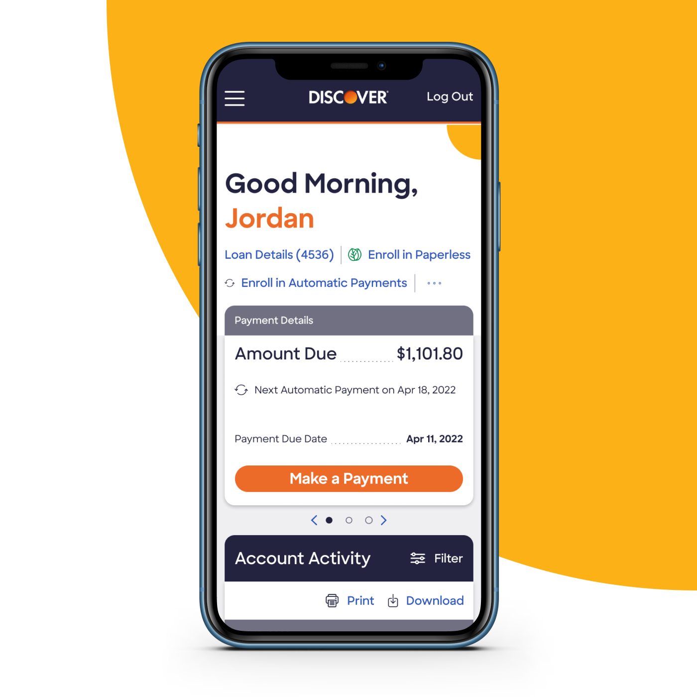
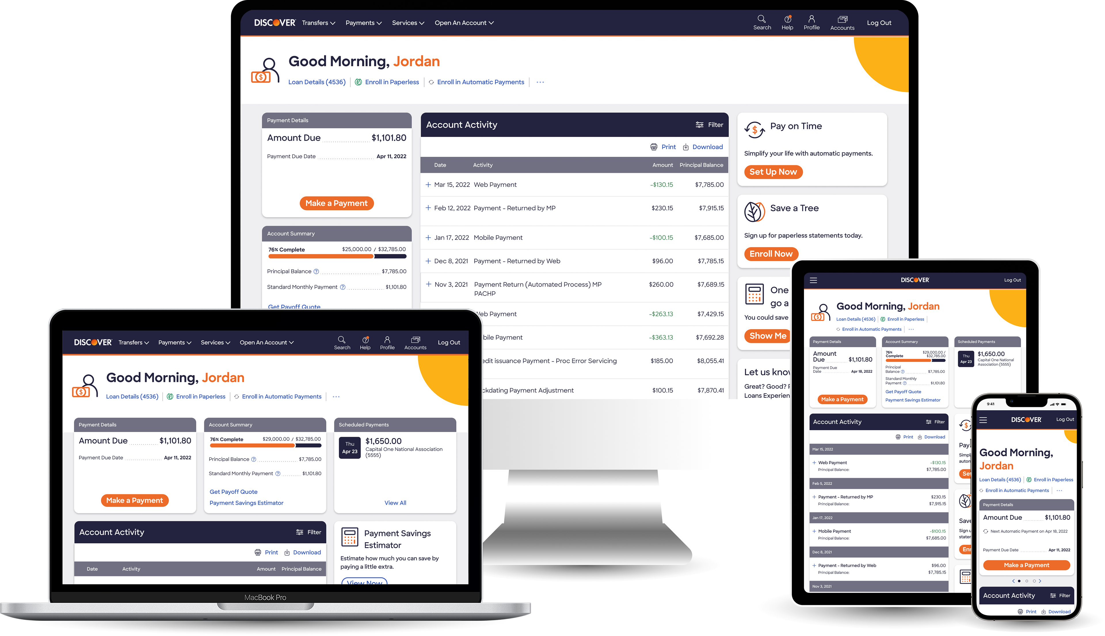
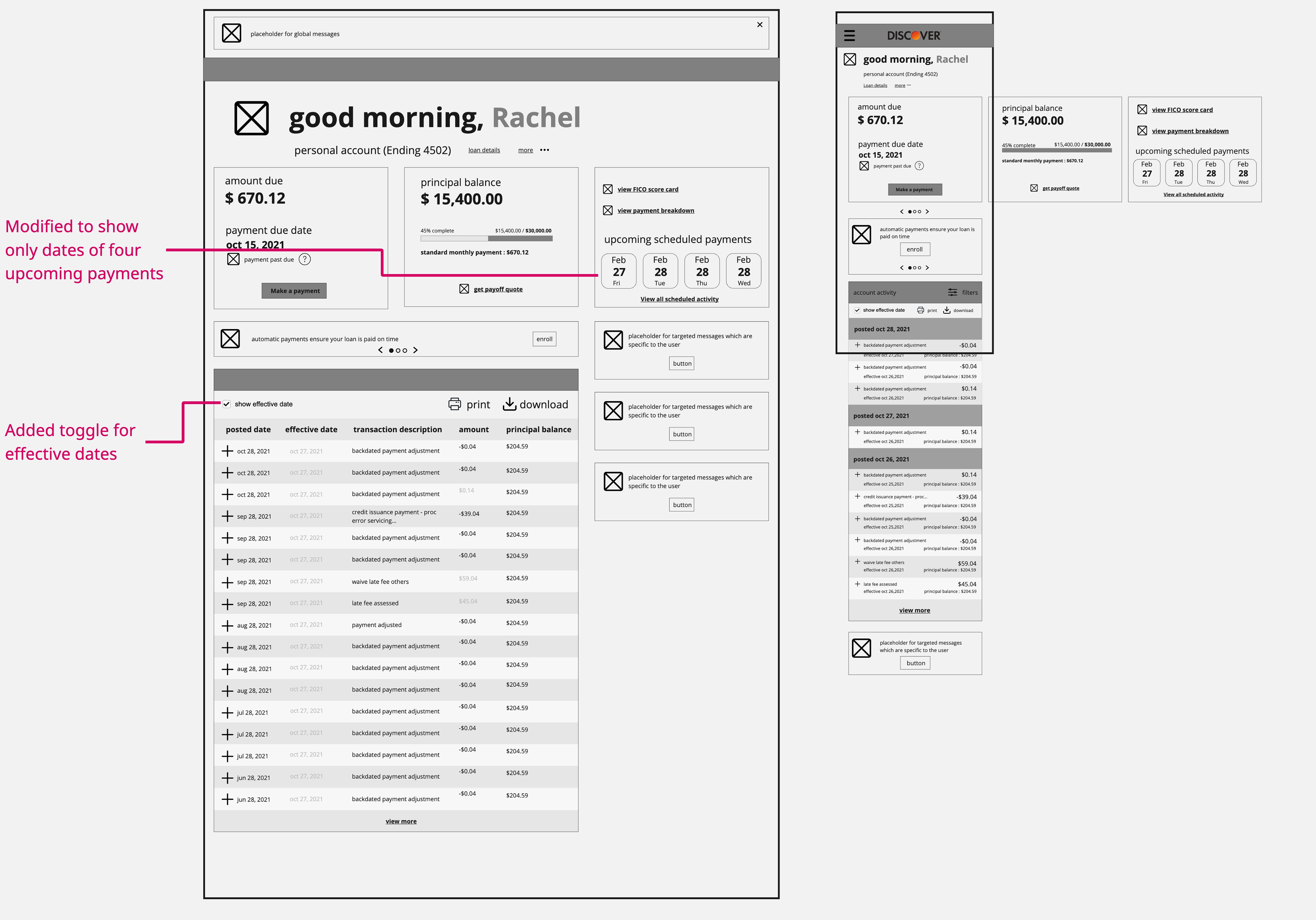
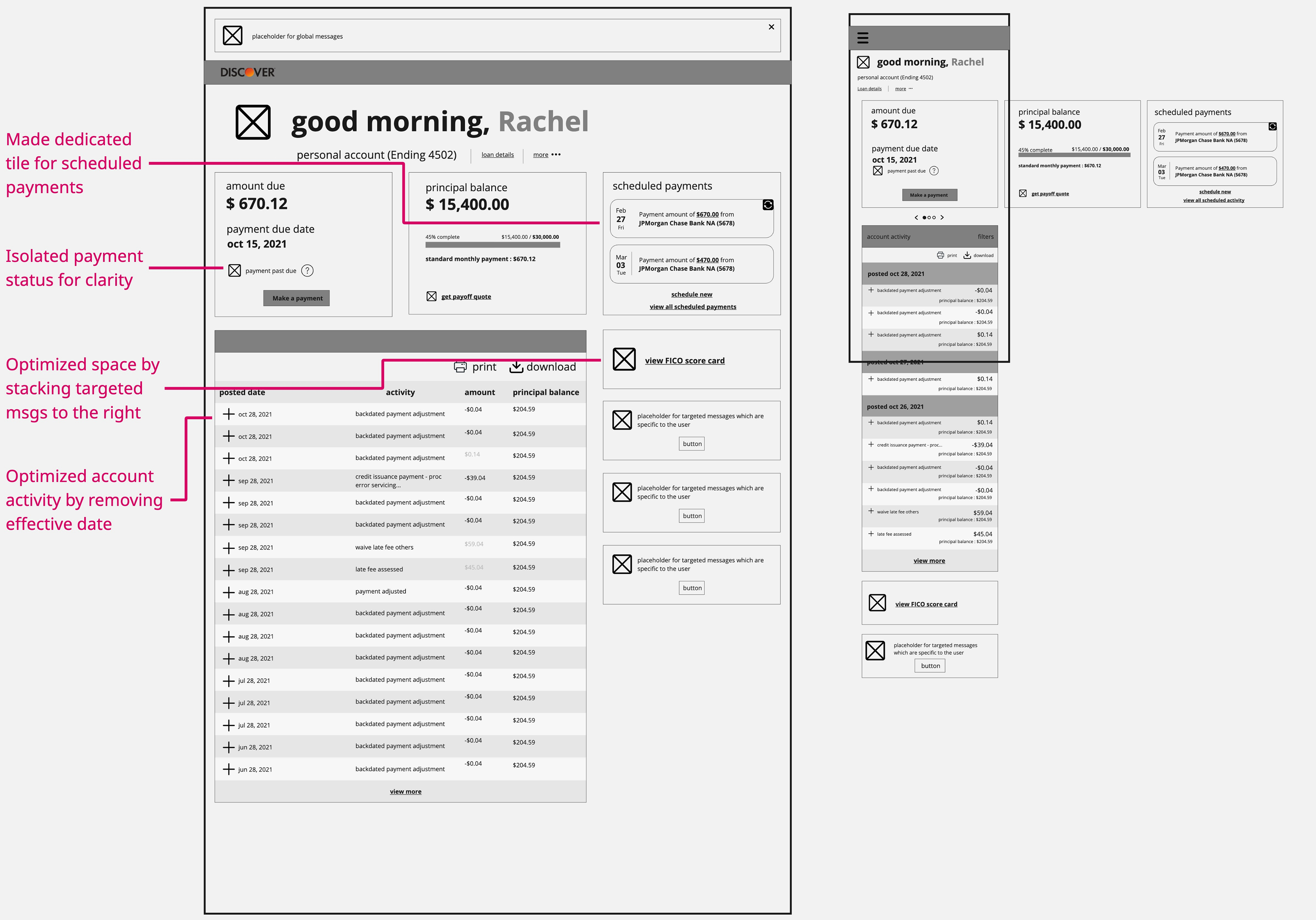
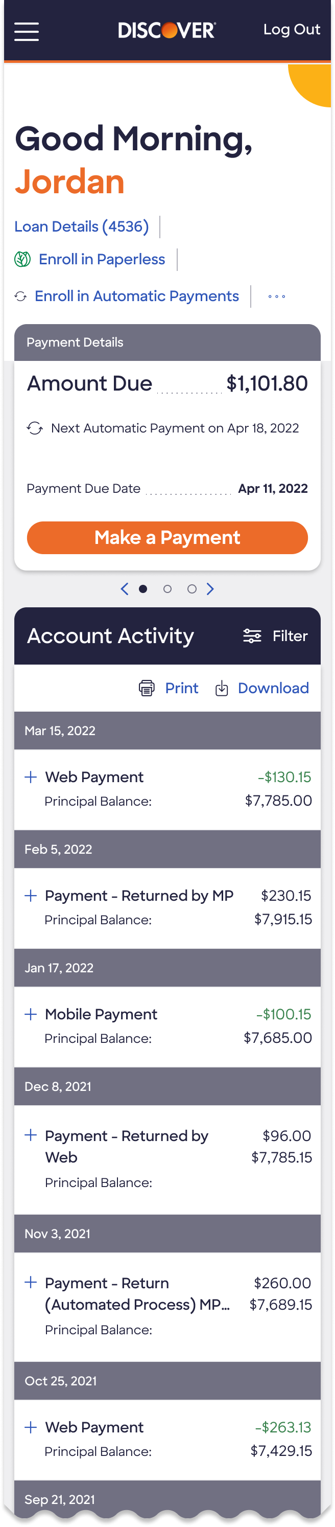
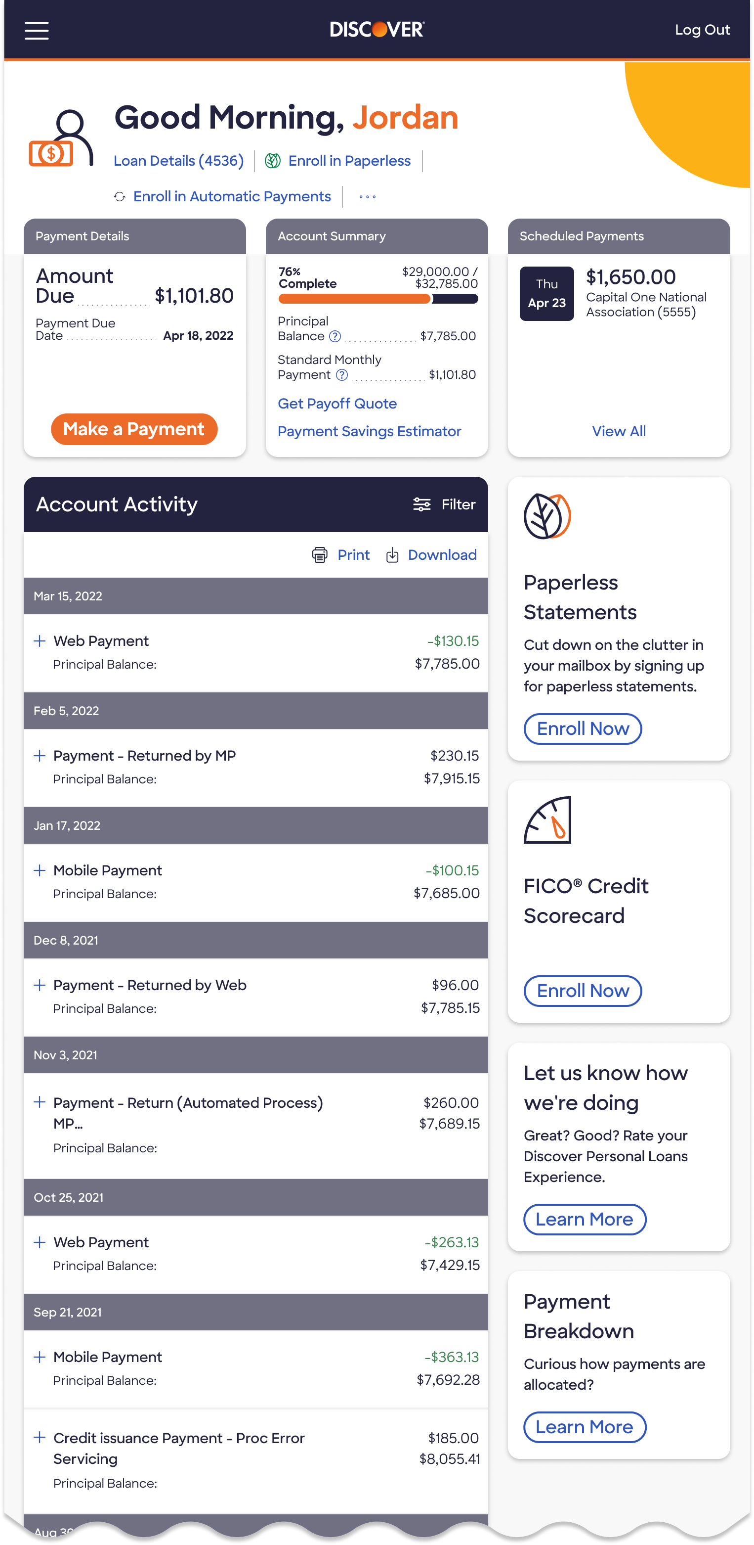
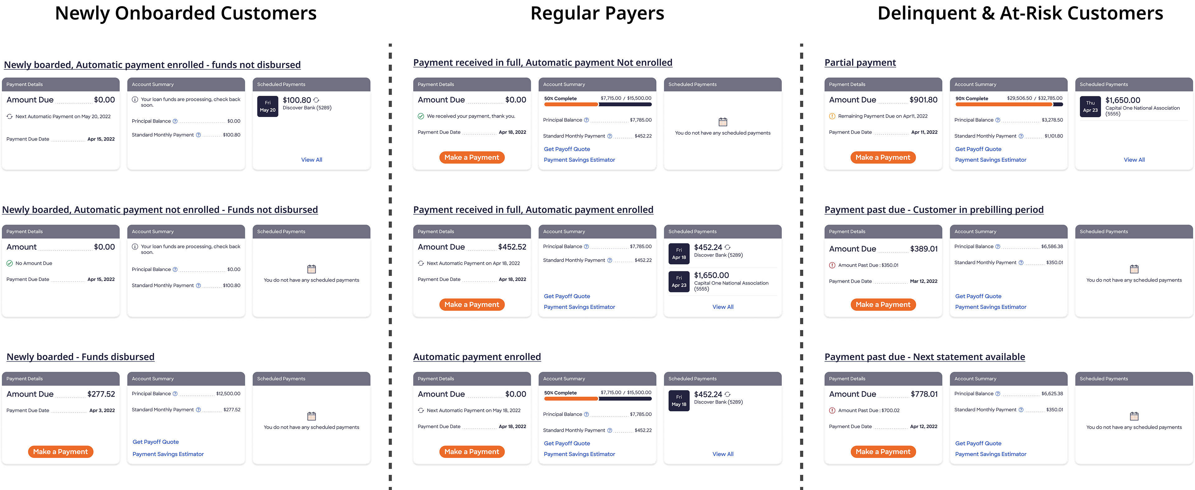
Final Designs
Below is a glimpse of the redesign that elevated the user experience.
Highlights of the Redesign
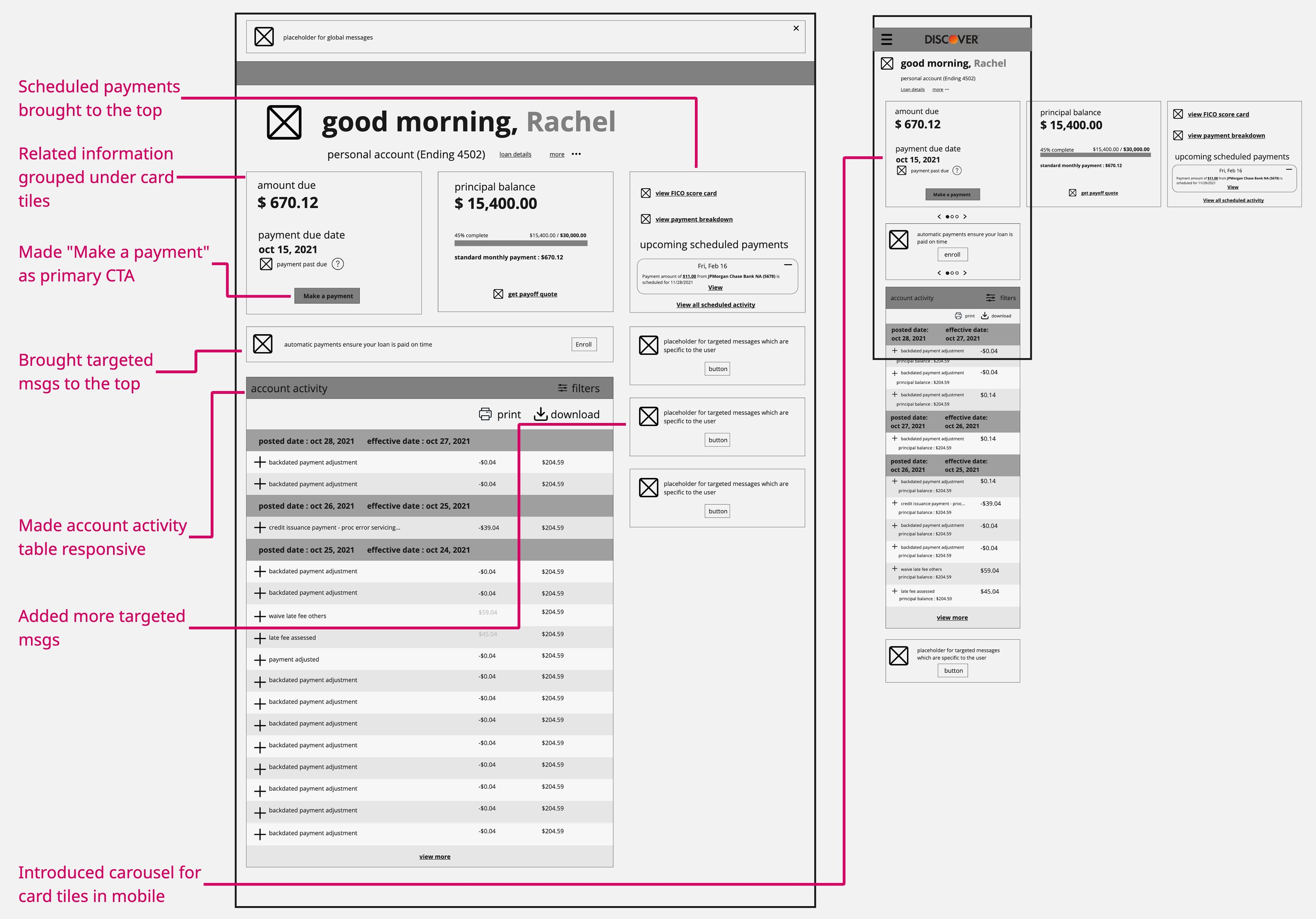
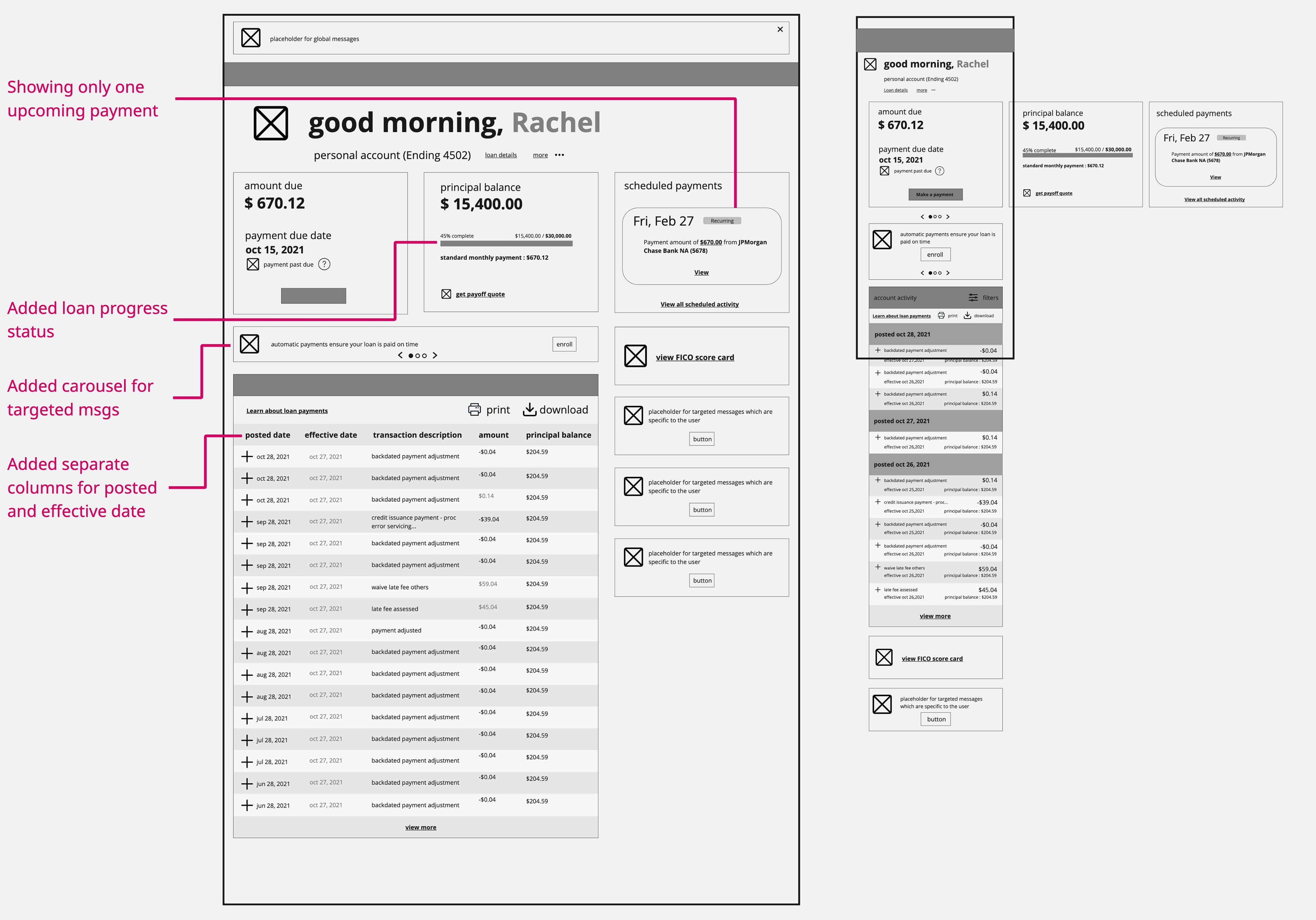
Information Prioritization: Structured the page to surface the most relevant loan details at the top and ensure accessibility on mobile.
Content Grouping: Grouped related content to enhance comprehension and user navigation.
Visual Hierarchy: Introduced visual weight, color, and clear calls to action to guide user attention.
Loan Pay-Down Progress: Added a progress bar to visualize percent complete and remaining principal balance.
“Make a Payment” Button: Designed as a prominent CTA for ease of access.
Payment Tile: Grouped payment-related information for clarity, highlighting scheduled payments and distinguishing Autopay with icons.
Responsive Design: Optimized layouts to provide a seamless experience across all viewports.
Cross-Sell Opportunities: Designed regions for targeted offers, enabling cross-sell and re-engagement opportunities.
Accessibility Compliance: Crafted the design with WCAG 2.1 AA standards in mind, ensuring color contrast, keyboard navigation, and screen reader compatibility to provide an inclusive experience for all users.
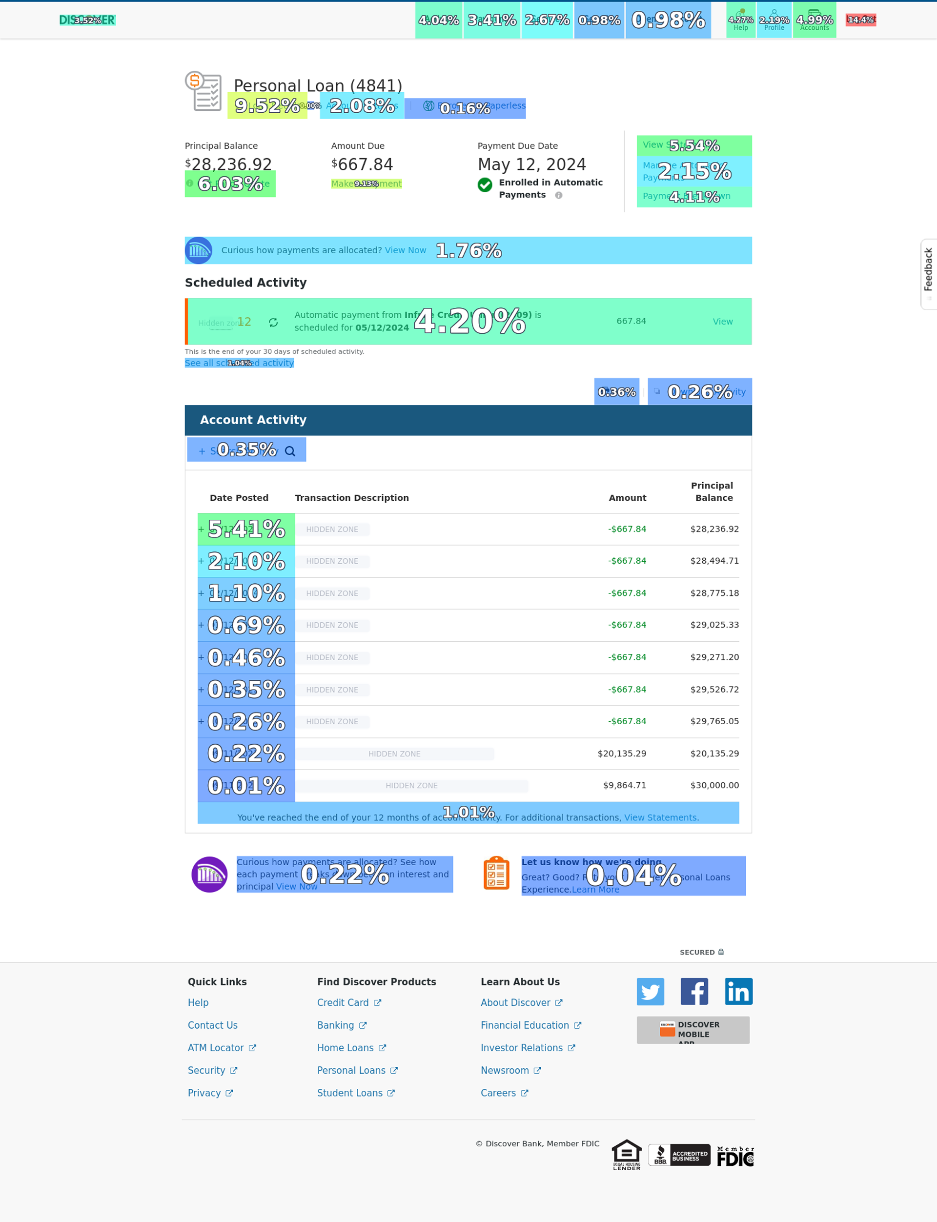
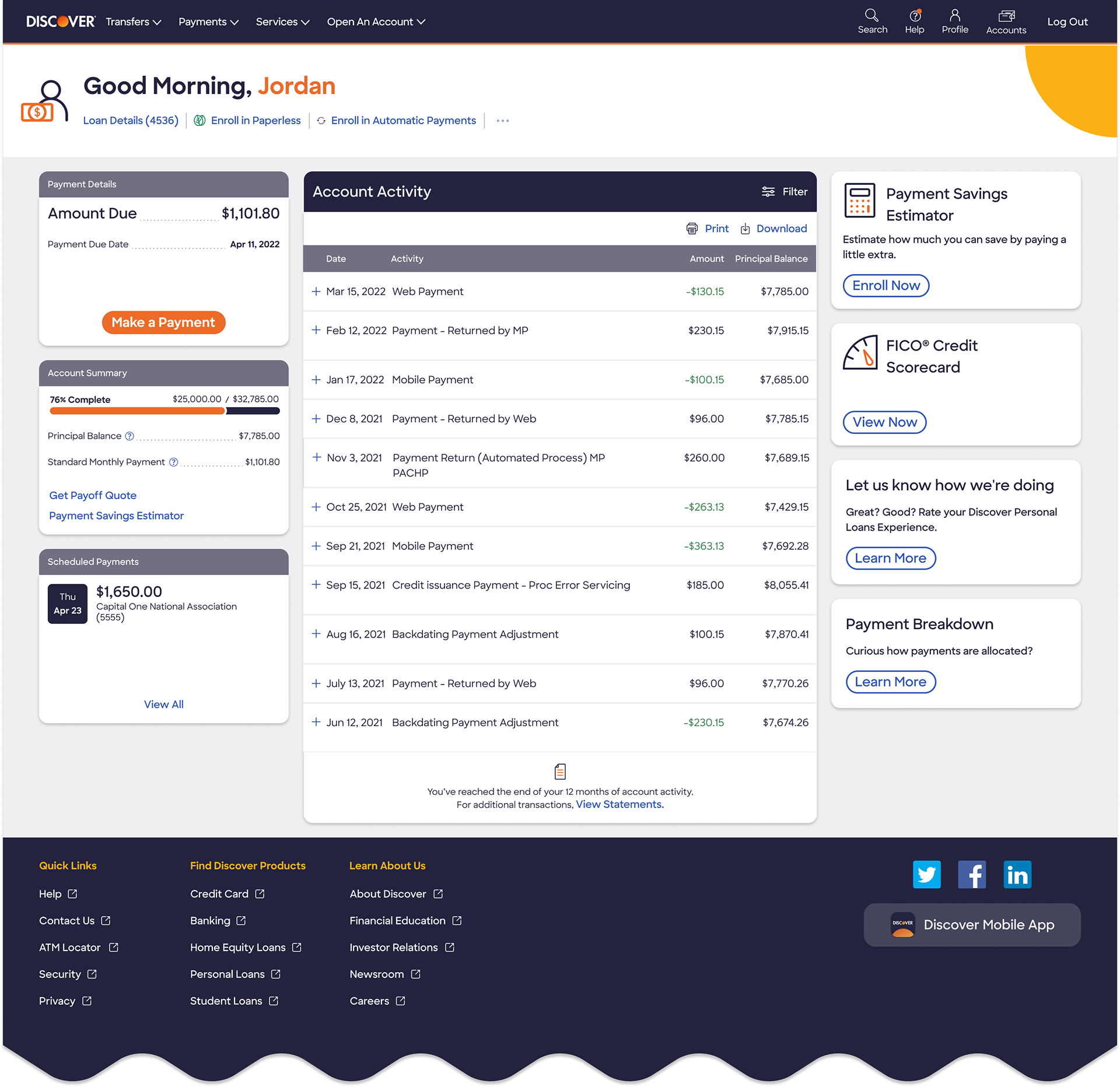
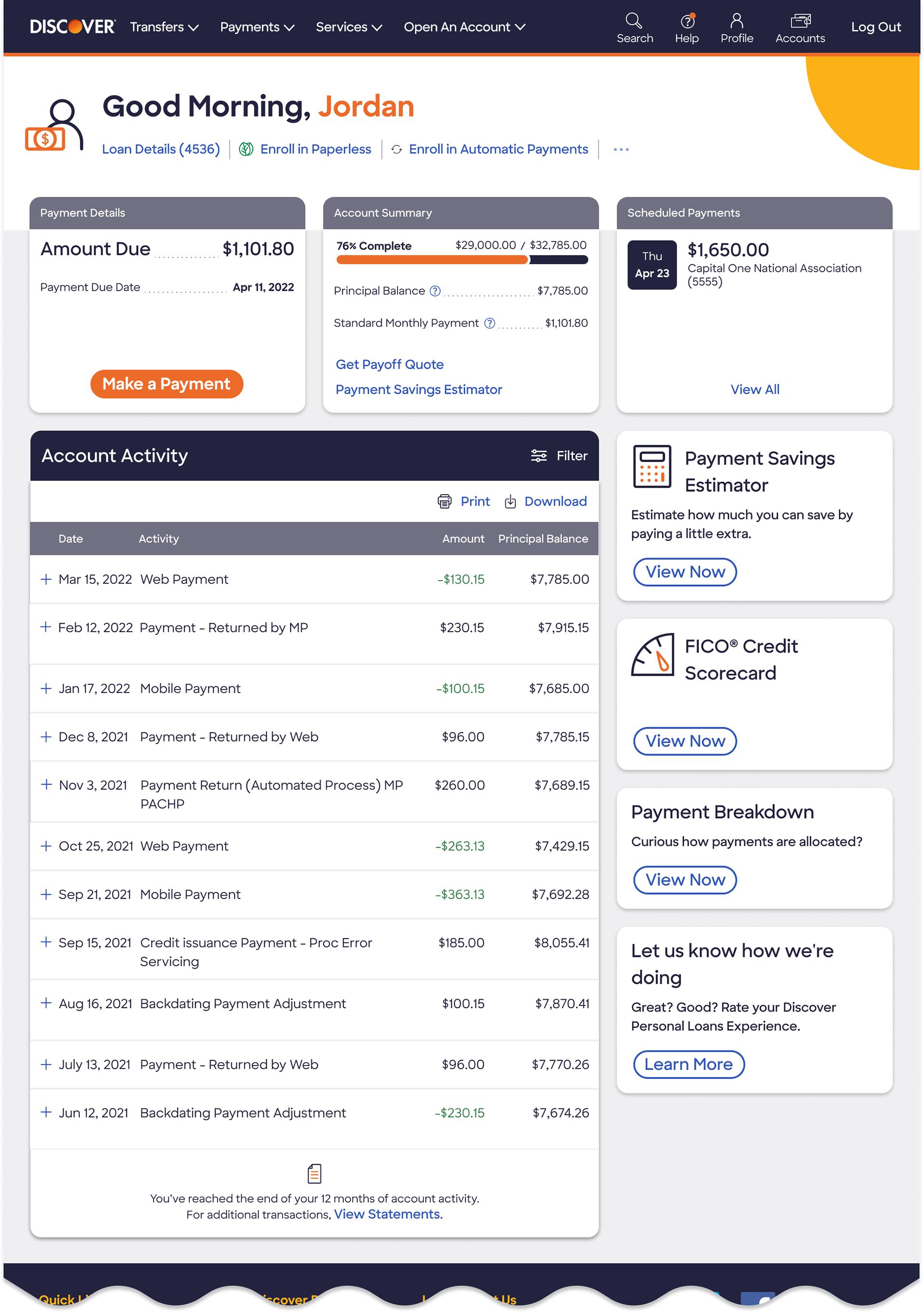
Existing VS Redesign
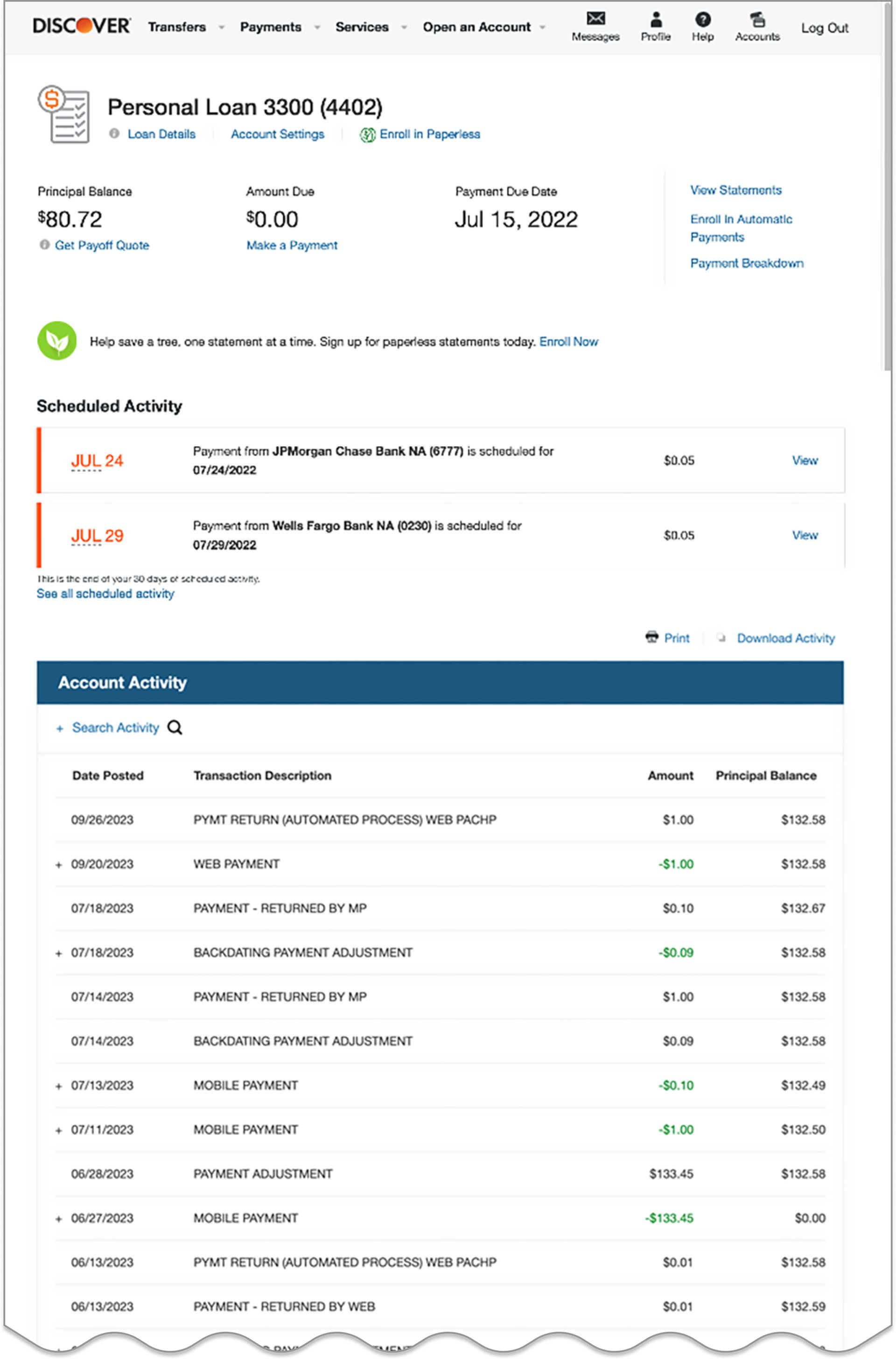
Existing design
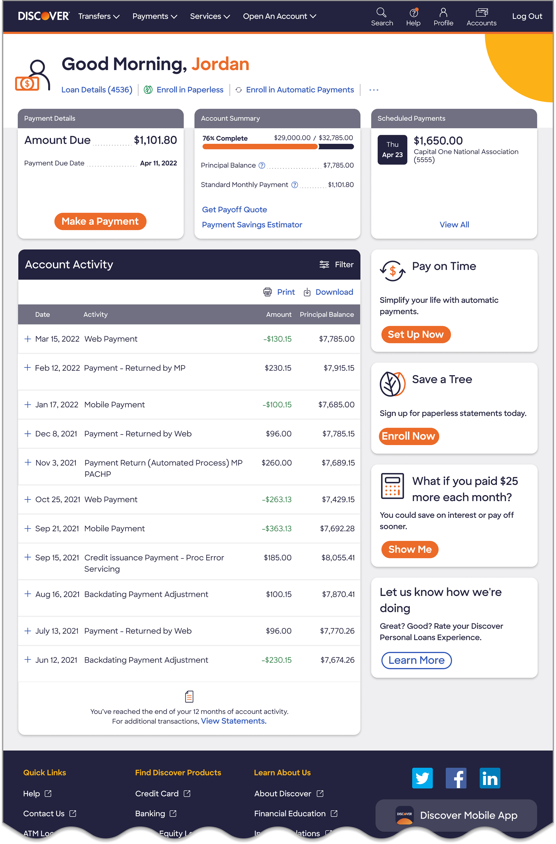
Redesign
Research
Before diving into the redesign, I conducted research to identify key pain points, understand user behavior, and align design goals with business objectives.
Customer Complaints Analysis
I analyzed the complaint logs using affinity diagramming to identify recurring pain points and usability issues affecting customer satisfaction. Here are the summary of key pain points:
1. Information Overload: Important loan details were buried in scattered sections, making it difficult for users to find key information quickly.
2. Confusing Layout: Users had difficulty locating their scheduled payments, increasing the risk of missed or duplicate payments.
3. Poor discoverability: The loan payoff option is buried within the interface, making it difficult for users to locate and access easily.
4. Lack of Visual Hierarchy: The interface lacked clear distinctions between critical actions (e.g., “Make a Payment”) and secondary links, causing confusion.
5. Mobile Accessibility Gaps: The design wasn’t fully optimized for mobile, making navigation cumbersome on smaller screens.
Stakeholder Interviews
Collaborated with key stakeholders—including the product owner, director of digital experience, and customer experience manager—to ensure design decisions aligned with business objectives and project goals. Below are the key objectives and success metrics defined by stakeholders:
Objectives
1. Enhance usability
2. Increase automatic payment enrolment
3. Reduce paper statement costs
Key Success Metrics
1. Reduce usability related complaints by 25%
2. Increase automatic payment enrolment by 75%
3. Increase paperless statements sign-ups by 60%
Behavioural Analytics
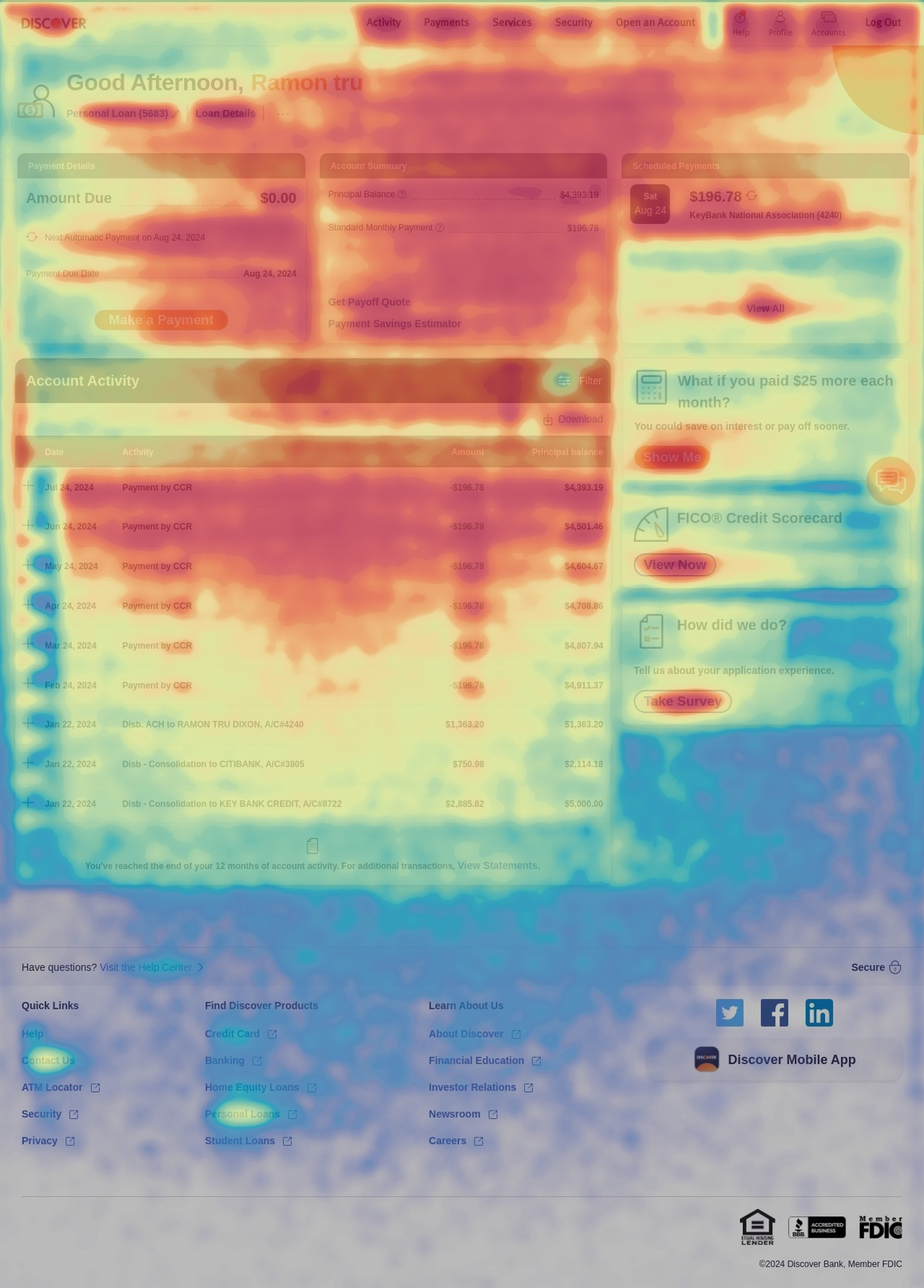
I have leveraged Contentsquare to track user interactions, identify friction points, and validate usability challenges with real-time behavioral data. These insights shaped improvements in information architecture, content grouping, and visual hierarchy. Below are the screen captures of click distribution and heat-map on the existing design.
Click distribution
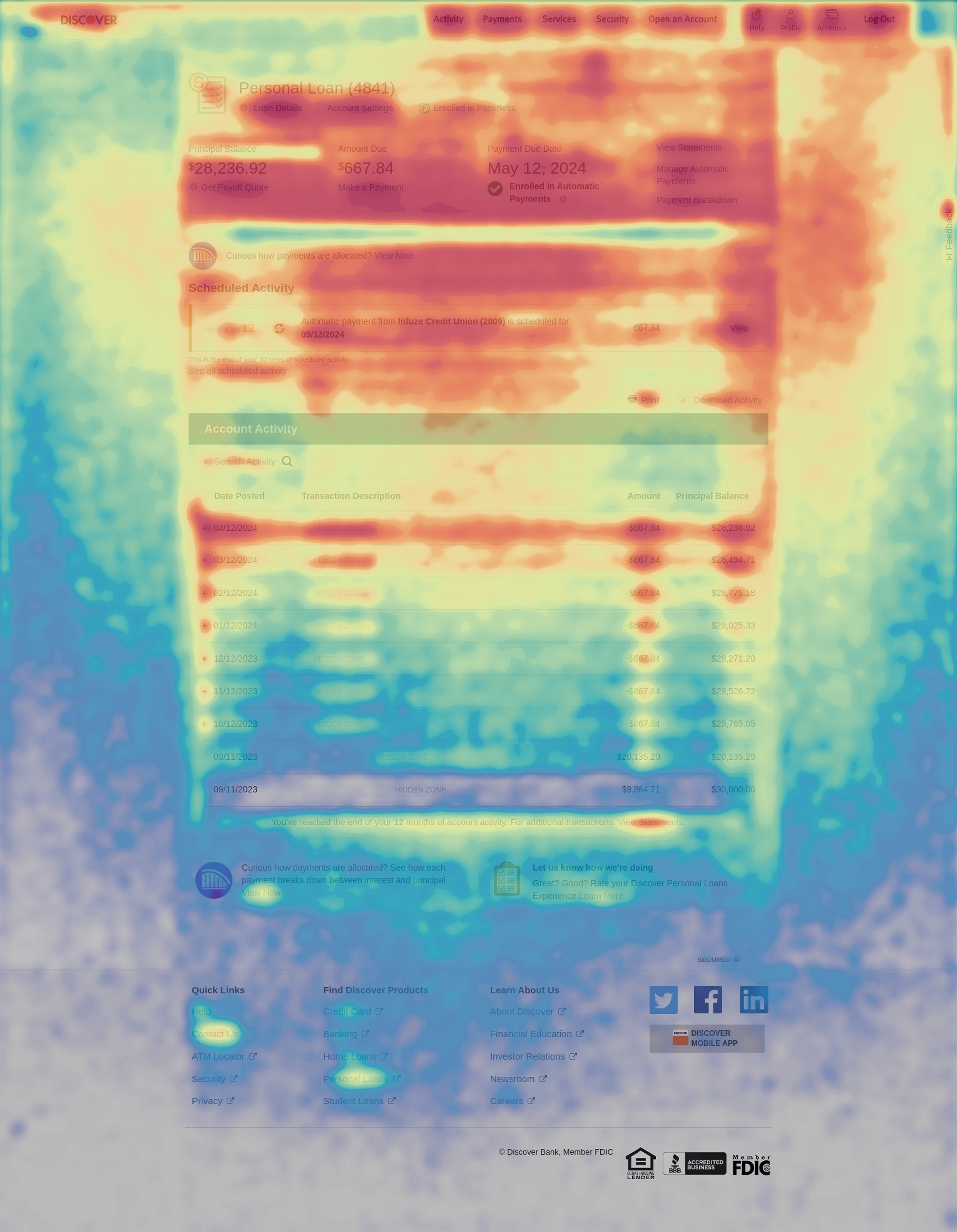
Heat-map
Behavioral Analysis Results
135,000
Unique users per month
175
Avg complaint calls per month
17
Frustration score
8.5 mins
Avg time spent per visit
Primary Tasks
Analysis of session replays, click distribution, heat maps, and journey completion rates revealed users’ primary tasks in the Account Center home, ranked in order of importance:
1. Scheduling a payment
2. Checking loan details
3. Modifying or deleting a scheduled payment
4. Viewing or downloading statements
5. Viewing, downloading, or printing account activity
Key Research Findings
• Users struggled to find critical loan details due to scattered information and poor content grouping.
• Scheduled payments were hard to locate, leading to missed or duplicate payments.
• The loan payoff option lacked discoverability, making it difficult for users to access.
• Lack of visual hierarchy caused confusion between primary actions and secondary links.
• Mobile experience had usability gaps, making navigation cumbersome on smaller screens.
• Business goals aligned with usability improvements, focusing on increasing automatic payments and paperless enrolments while reducing complaints.
• Behavioural analytics identified usability issues and guided improvements in layout, content prioritization, and accessibility.
Ideation
Evolution of design - Wireframe iterations
Iteration 1
Iteration 2
Iteration 3
Iteration 4
Key Highlights of the redesign
Responsive & Accessible: Tailored UX for Every Screen
Personalized Dynamic Greeting Banner for Enhanced User Engagement
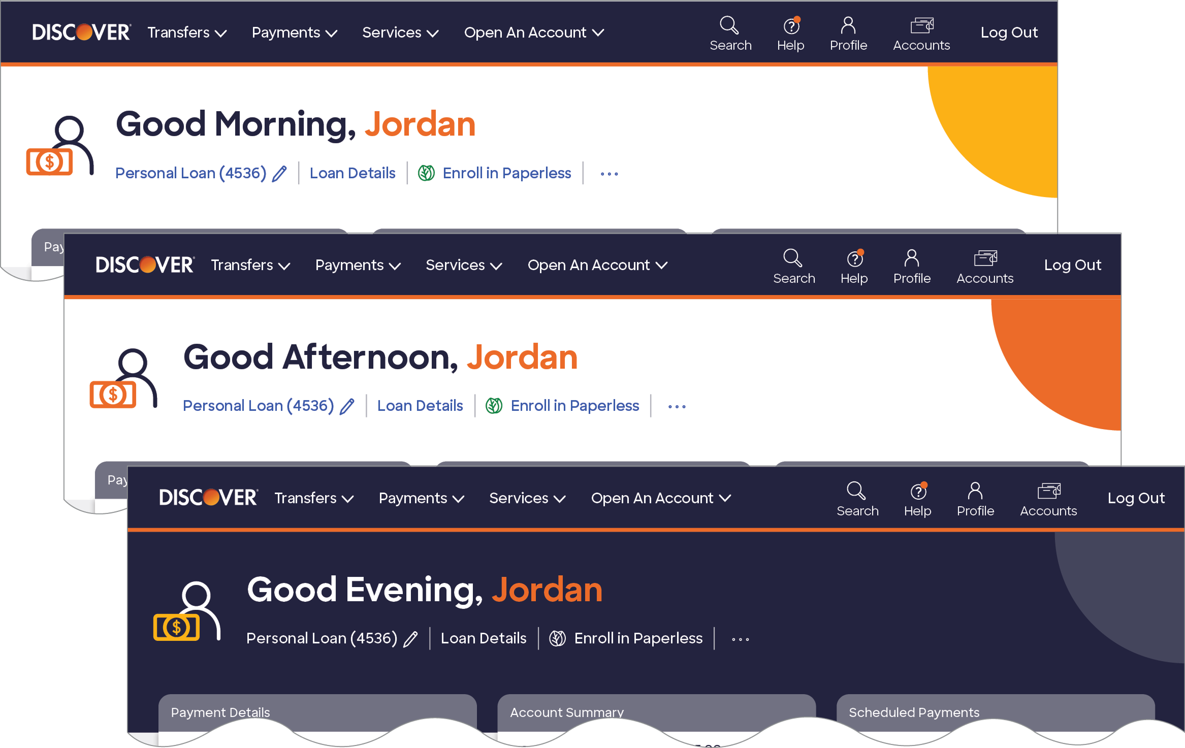
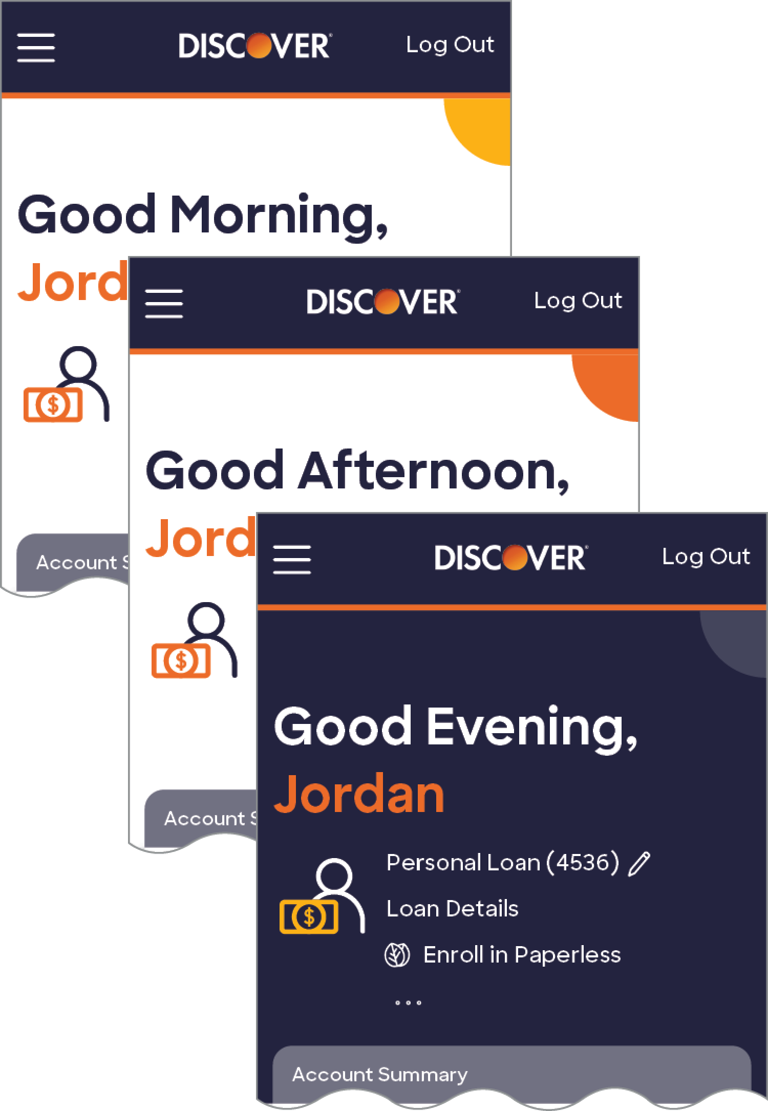
Time-Based Themes: Dynamic backgrounds (e.g., morning sun, afternoon glow, midnight sky) make the interface visually engaging and context-aware.
Personalized Greetings: Displays the user’s name, adding a personal and welcoming touch to enhance engagement.
By combining personalization and context-aware design, this approach creates a meaningful and engaging user experience.
Seamless Loan Experiences for Every Customer
Adaptive Account Activity Table for Every Screen
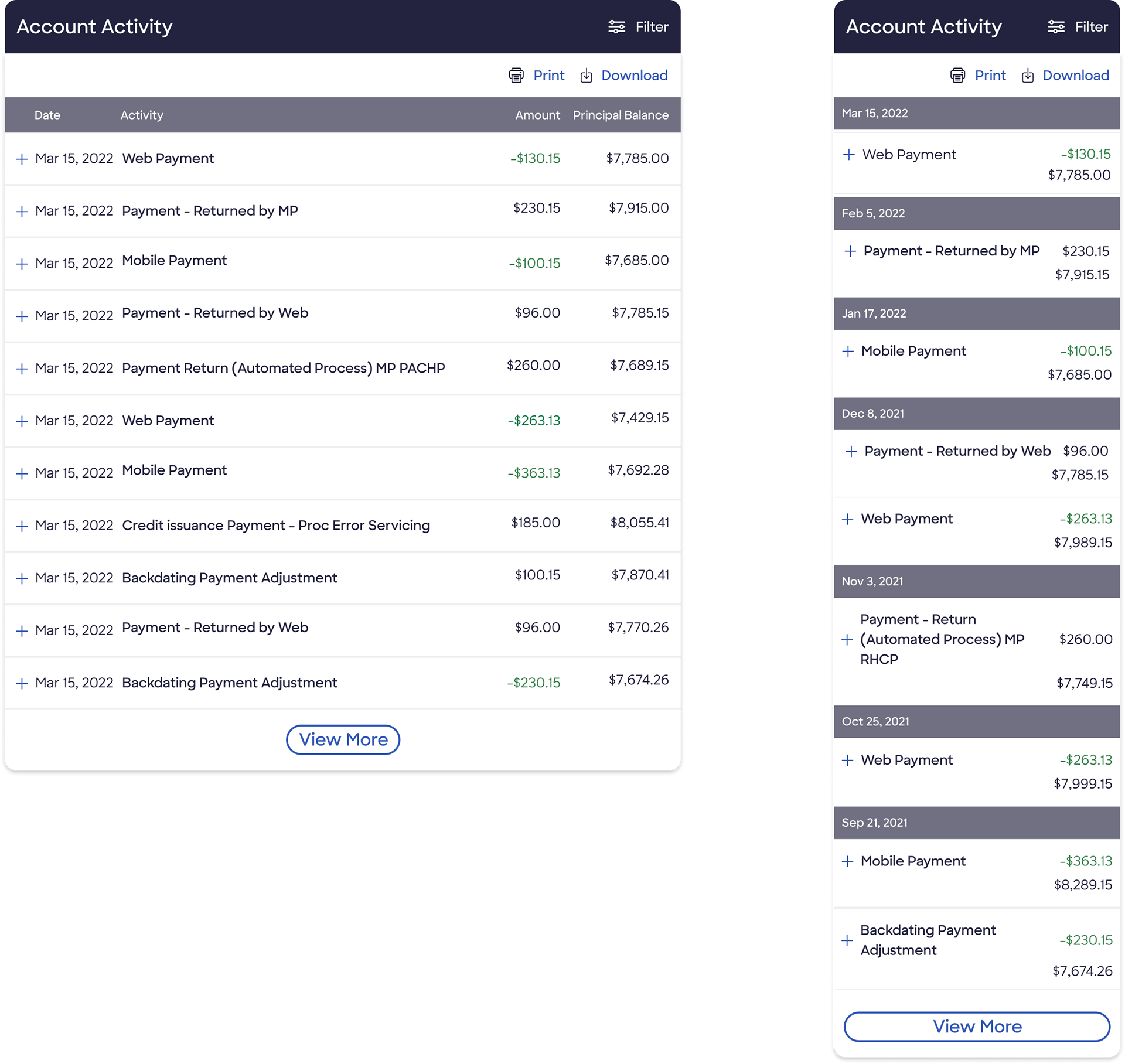
Account activity table - Standard view
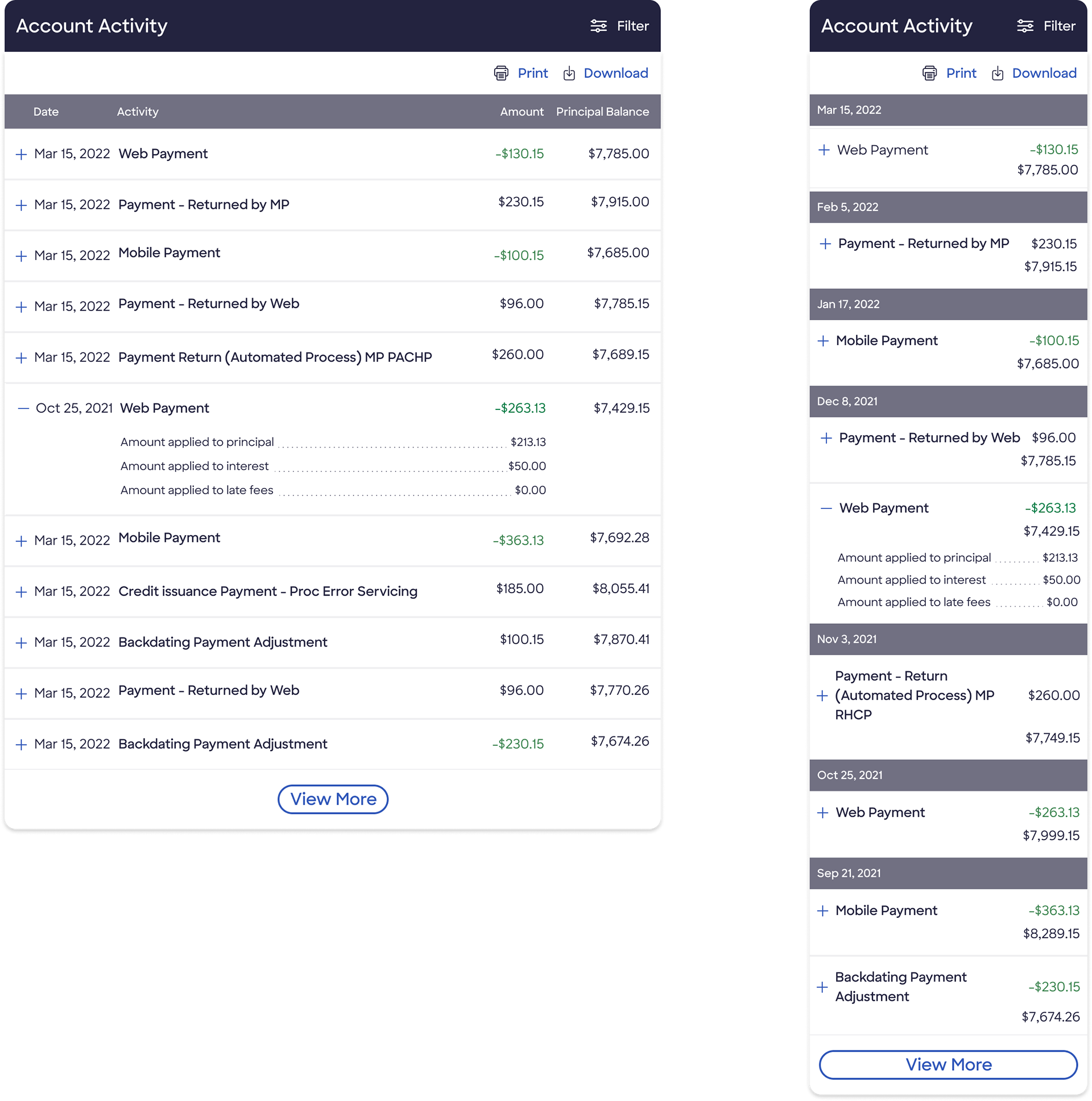
Account activity table - Expanded view
Results
Comparison of heat-maps before and after redesign

Account Center - Previous design
Account Center - Redesigned
Metrics
Key Success Metrics
Outcome
• Enhanced user experience with improved usability, intuitive design, and optimized workflows, reducing frustration and increasing engagement.
• Improved self-service efficiency, enabling users to complete tasks independently, leading to higher customer retention.
• Reduced support call volume, lowering operational costs and boosting overall operational efficiency in loan management.
Lessons Learned
• Minimized development rework by adopting a shift-left approach, ensuring early integration of accessibility annotations.
• Enrolment targets unmet: Despite improvements in Auto Pay and Paperless Statements enrolment, targets weren’t fully achieved. A journey-level and relationship-based approach is needed beyond interaction-level changes.
• Mobile-first shift: Portal usage saw a seismic shift—previously 60% desktop vs. 40% mobile, now 40% desktop vs. 60% mobile, emphasizing the need for a mobile-optimized experience.